It's not even 2013 yet, winter is still settling in, even the shortest day of the year (here in the northern hemisphere, that is) has not arrived yet and some bossy thing called Pantone has declared what colors we are to wear and live in this coming spring. There is even a "color of the year", like a Miss America chosen and crowned, that reigns over the season's palette.
The very wonderful thing about a group of colors chosen by good colorists is the inspiration it can provide. The limitations are the freedom. Parameters can spur creativity where an endless abyss of options can be paralyzing. Ten colors, only ten, but how much fun those can be. Here they are.
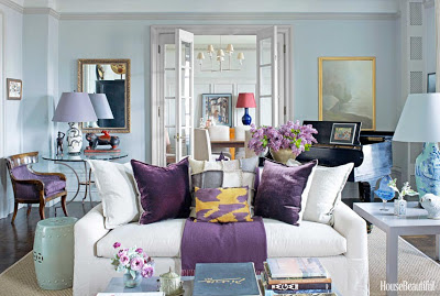
Emerald, the tiara wearing winner of color of the year. Dusk blue, grayed jade, tender shoots, lemon zest, african violet, linen, monaco blue, poppy red, and nectarine. Not very exciting as a line of colored dots on paper but quite amazing as the palette for a pleasant room, or perhaps a wardrobe. And just what do these colors look like in practice? In a room, like this, from House Beautiful's December/January 2013 issue. If you look closely you will see all of the ten colors.
Grayed jade in the barrel type side table and the lamp in the distance gives the monaco blue and poppy red. Nice proportions of the amounts of color.
The neutral of linen calms everything and sets it off at the same time.
Emerald, the color of the year, in modest spots that make the room lovely and interesting instead of a place consumed by trend. How pretty these are together!
In my wardrobe:
Unwittingly I followed Pantone's rulings when I recently bought the "Shimmer Me" jacket by Columbia for my winter wardrobe. In emerald, it was the color that was to my eyes the least of the evils and was offered at the best of the discounts, things that rule my shopping much more than current fashion. I know the Pantone police will not be patrolling the wilderness where I will be wearing this jacket but the ideas that are forming in my head about colors to wear with this emerald are invigorating. A dusky blue top, a bit of poppy red somewhere, just a tiny bit like the painting above, perhaps with african violet grounding it all. Yes, winter might be more than just keeping warm this way!
Wishing you creative thoughts and happy sewing!


